📄 expo/router/advanced/native-tabs
File: native-tabs.md | Updated: 11/15/2025
Source: https://docs.expo.dev/router/advanced/native-tabs
Hide navigation
Search
Ctrl K
Home Guides EAS Reference Learn
Archive Expo Snack Discord and Forums Newsletter
Native tabs
Copy page
Learn how to use the native tabs layout in Expo Router.
Copy page
Native tabs is an experimental feature available in SDK 54 and later, and its API is subject to change.
Tabs are a common way to navigate between different sections of an app. In Expo Router, you can use different tab layouts, depending on your needs. This guide covers the native tabs. Unlike the other tabs layout , native tabs use the native system tab bar.
For other tab layouts see:
Custom tabs
See custom tabs if your app requires a fully custom design that is not possible using system tabs.
JavaScript tabs
See JavaScript tabs if you already use React Navigation's tabs.
You can use file-based routing to create a tabs layout. Here's an example file structure:
app
_layout.tsx
index.tsx
settings.tsx
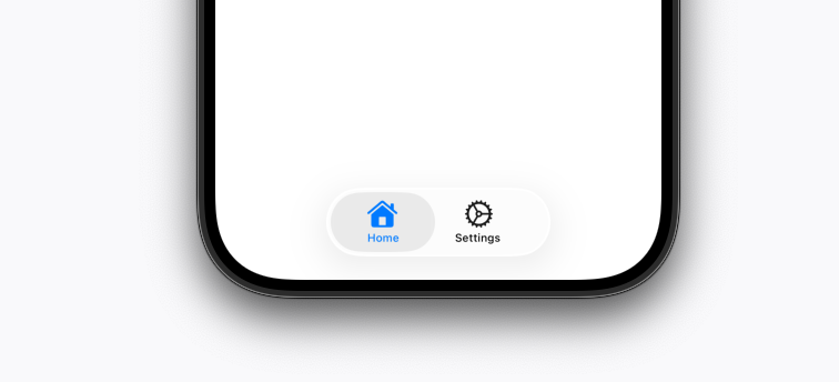
The above file structure produces a layout with a tab bar at the bottom of the screen. The tab bar will have two tabs: Home and Settings.

You can use the app/_layout.tsx file to define your app's root layout using tabs. This file is the main layout file for the tab bar and each tab. Inside it, you can control how the tab bar and each tab item look and behave.
app/_layout.tsx
Copy
import { NativeTabs, Icon, Label } from 'expo-router/unstable-native-tabs'; export default function TabLayout() { return ( <NativeTabs> <NativeTabs.Trigger name="index"> <Label>Home</Label> <Icon sf="house.fill" drawable="custom_android_drawable" /> </NativeTabs.Trigger> <NativeTabs.Trigger name="settings"> <Icon sf="gear" drawable="custom_settings_drawable" /> <Label>Settings</Label> </NativeTabs.Trigger> </NativeTabs> ); }
Finally, you have the two tab files that make up the content of the tabs: app/index.tsx and app/settings.tsx.
app/index.tsx and app/settings.tsx
Copy
import { View, Text, StyleSheet } from 'react-native'; export default function Tab() { return ( <View style={styles.container}> <Text>Tab [Home|Settings]</Text> </View> ); } const styles = StyleSheet.create({ container: { flex: 1, justifyContent: 'center', alignItems: 'center', }, });
The tab file named index.tsx is the default tab when the app loads. The second tab file settings.tsx shows how you can add more tabs to the tab bar.
In contrast to the Stack navigator, tabs are not automatically added to the tab bar. You need to explicitly add them in your layout file using the
NativeTabs.Trigger.
When you want to customize the tab bar item, we recommend using the components API designed for this purpose. Currently, you can customize:
- Icon: The icon displayed in the tab bar item.
- Label: The label displayed in the tab bar item.
- Badge: The badge displayed in the tab bar item.
Icon
You can use the Icon component to customize the icon displayed in the tab bar item. The Icon component accepts a drawable prop for Android drawables, a sf prop for Apple's SF Symbols icons, or a src prop for custom images.
Alternatively, you can pass {default: ..., selected: ...} to either the sf or src prop to specify different icons for the default and selected states.
To use
drawableprops on Android, you can use built-in drawables or add custom drawables .
app/_layout.tsx
Copy
import { NativeTabs, Icon } from 'expo-router/unstable-native-tabs'; export default function TabLayout() { return ( <NativeTabs> <NativeTabs.Trigger name="index"> <Icon sf={{ default: 'house', selected: 'house.fill' }} drawable="custom_home_drawable" /> </NativeTabs.Trigger> <NativeTabs.Trigger name="settings"> <Icon src={require('../../../assets/setting_icon.png')} /> </NativeTabs.Trigger> </NativeTabs> ); }
Liquid glass on iOS automatically changes colors based on if the background color is light or dark. There is no callback for this, so you need to use a PlatformColor to set the color of the icon.
app/_layout.tsx
Copy
import { DynamicColorIOS } from 'react-native'; import { NativeTabs, Icon } from 'expo-router/unstable-native-tabs'; export default function TabLayout() { return ( <NativeTabs labelStyle={{ // For the text color color: DynamicColorIOS({ dark: 'white', light: 'black', }), }} // For the selected icon color tintColor={DynamicColorIOS({ dark: 'white', light: 'black', })}> <NativeTabs.Trigger name="index"> <Icon sf={{ default: 'house', selected: 'house.fill' }} drawable="custom_home_drawable" /> </NativeTabs.Trigger> <NativeTabs.Trigger name="settings"> <Icon src={{ default: require('../../../assets/setting_icon.png'), selected: require('../../../assets/selected_setting_icon.png'), }} /> </NativeTabs.Trigger> </NativeTabs> ); }
Show More
Label
You can use the Label component to customize the label displayed in the tab bar item. The Label component accepts a string label passed as a child. If no label is provided, the tab bar item will use the route name as the label.
If you don't want to display a label, you can use the hidden prop to hide the label.
app/_layout.tsx
Copy
import { NativeTabs, Label } from 'expo-router/unstable-native-tabs'; export default function TabLayout() { return ( <NativeTabs> <NativeTabs.Trigger name="index"> <Label>Home</Label> </NativeTabs.Trigger> <NativeTabs.Trigger name="settings"> <Label hidden /> </NativeTabs.Trigger> </NativeTabs> ); }
Badge
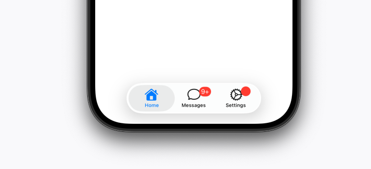
You can use the Badge component to customize the badge displayed for the tab bar item. The badge is an additional mark on top of the tab and useful for showing notification or unread message counts.
app/_layout.tsx
Copy
import { NativeTabs, Badge } from 'expo-router/unstable-native-tabs'; export default function TabLayout() { return ( <NativeTabs> <NativeTabs.Trigger name="messages"> <Badge>9+</Badge> </NativeTabs.Trigger> <NativeTabs.Trigger name="settings"> <Badge /> </NativeTabs.Trigger> </NativeTabs> ); }

Since the native tab layout's appearance varies by platform, the customization options are also different. For all customization options, see the API reference for NativeTabs
.
Hide a tab conditionally
If you want to hide a tab based on a condition, you can either remove the trigger or pass the hidden prop to the NativeTabs.Trigger component.
app/_layout.tsx
Copy
import { NativeTabs } from 'expo-router/unstable-native-tabs'; export default function TabLayout() { const shouldHideMessagesTab = true; // Replace with your condition return ( <NativeTabs> <NativeTabs.Trigger name="messages" hidden={shouldHideMessagesTab} /> </NativeTabs> ); }
Note: Marking a tab as
hiddenmeans it cannot be navigated to in any way.
Dismiss behavior
Currently this is an iOS-only feature, but we plan to add it to Android in the future.
By default, tapping a tab that is already active closes all screens in that tab's stack and returns to the root screen. You can disable this by setting the disablePopToTop prop on the NativeTabs.Trigger component.
app/_layout.tsx
Copy
import { NativeTabs, Label } from 'expo-router/unstable-native-tabs'; export default function TabLayout() { return ( <NativeTabs> <NativeTabs.Trigger name="index" disablePopToTop> <Label>Home</Label> </NativeTabs.Trigger> <NativeTabs.Trigger name="settings"> <Label>Settings</Label> </NativeTabs.Trigger> </NativeTabs> ); }
Scroll to top
Currently this is an iOS-only feature, but we plan to add it to Android in the future.
By default, tapping a tab that is already active and showing its root screen scrolls the content back to the top. You can disable this by setting the disableScrollToTop prop on the NativeTabs.Trigger component.
app/_layout.tsx
Copy
import { NativeTabs, Label } from 'expo-router/unstable-native-tabs'; export default function TabLayout() { return ( <NativeTabs> <NativeTabs.Trigger name="index" disableScrollToTop> <Label>Home</Label> </NativeTabs.Trigger> <NativeTabs.Trigger name="settings"> <Label>Settings</Label> </NativeTabs.Trigger> </NativeTabs> ); }
iOS 26 features
To use features described in this section, compile your app with Xcode 26 or higher.
Separate search tab

To add a separate search tab, assign the role with its value set to search to the native tab you want to display separately.
app/_layout.tsx
Copy
import { NativeTabs, Label } from 'expo-router/unstable-native-tabs'; export default function TabLayout() { return ( <NativeTabs> <NativeTabs.Trigger name="index"> <Label>Home</Label> </NativeTabs.Trigger> <NativeTabs.Trigger name="search" role="search"> <Label>Search</Label> </NativeTabs.Trigger> </NativeTabs> ); }
Tabbar search input

To add a search field to the tab bar, wrap the screen in a Stack navigator and configure headerSearchBarOptions.
app
_layout.tsx
index.tsx
search
_layout.tsx
index.tsx
app/_layout.tsx
Copy
import { NativeTabs, Label } from 'expo-router/unstable-native-tabs'; export default function TabLayout() { return ( <NativeTabs> <NativeTabs.Trigger name="index"> <Label>Home</Label> </NativeTabs.Trigger> <NativeTabs.Trigger name="search" role="search"> <Label>Search</Label> </NativeTabs.Trigger> </NativeTabs> ); }
app/search/_layout.tsx
Copy
import { Stack } from 'expo-router'; export default function SearchLayout() { return ( <Stack> <Stack.Screen name="index" options={{ title: 'Search', headerSearchBarOptions: { placement: 'automatic', placeholder: 'Search', onChangeText: () => {}, }, }} /> </Stack> ); }
Show More
app/search/index.tsx
Copy
import { ScrollView } from 'react-native'; export default function SearchIndex() { return <ScrollView>{/* Screen content */}</ScrollView>; }
Tab bar minimize behavior
To implement the minimized behavior on the tab bar, you can use minimizeBehavior
prop on NativeTabs. In the example below, the tab bar is minimized when scrolling down.
app/_layout.tsx
Copy
import { NativeTabs, Label } from 'expo-router/unstable-native-tabs'; export default function TabLayout() { return ( <NativeTabs minimizeBehavior="onScrollDown"> <NativeTabs.Trigger name="index"> <Label>Home</Label> </NativeTabs.Trigger> <NativeTabs.Trigger name="tab-1"> <Label>Tab 1</Label> </NativeTabs.Trigger> </NativeTabs> ); }
Integration with @expo/vector-icons
Recommended: Use SF Symbols on iOS . They offer a more native platform feeling compared to vector icons.
To use icons from @expo/vector-icons, you can use VectorIcon component.
app/_layout.tsx
Copy
import MaterialIcons from '@expo/vector-icons/MaterialIcons'; import { NativeTabs, Icon, VectorIcon } from 'expo-router/unstable-native-tabs'; import { Platform } from 'react-native'; export default function TabLayout() { return ( <NativeTabs minimizeBehavior="onScrollDown"> <NativeTabs.Trigger name="index"> <Label>Home</Label> {Platform.select({ ios: <Icon sf="house.fill" />, android: <Icon src={<VectorIcon family={MaterialIcons} name="home" />} />, })} </NativeTabs.Trigger> </NativeTabs> ); }
Migrating from JavaScript tabs
Native tabs are not designed to be a drop-in replacement for JavaScript tabs . The native tabs are constrained to the native platform behavior, whereas the JavaScript tabs can be customized more freely. If you aren't interested in the native platform behavior, you can continue using the JavaScript tabs.
Use Trigger instead of Screen
NativeTabs introduces the concept of a Trigger for adding routes to a layout. Unlike a Screen, which styles routes that are added automatically, the Trigger system gives you better control for hiding and removing tabs from the tab bar.
Use React components instead of props
NativeTabs has a React-first API that opts to use components for defining UI in favor of props objects.
- options={{ - tabBarIcon: ({ focused, color, size }) => ( - <Icon name="home" color={color} size={size} /> - ), - }} + <Icon sf="house" drawable="home_drawable" />
Use Stacks inside tabs
The JavaScript <Tabs /> have a mock stack header which is not present in the native tabs. Instead, you should nest a native <Stack /> layout inside the native tabs to support both headers and pushing screens.
A limit of 5 tabs on Android
On Android, there is a limitation of having a maximum of 5 tabs in the tab bar. This restriction comes from the platform's Material Tabs component.
Cannot measure the tab bar height
The tabs move around, sometimes being on top of the screen when rendering on iPad, sometimes on the side of the screen when running on Apple Vision Pro, and so on. We're working on a layout function to provide more detailed layout info in the future.
No support for nested native tabs
Native tabs cannot be nested inside other native tabs. You can still nest JavaScript tabs inside native tabs.
Limited support for FlatList
FlatList
integration with native tabs has limitations. Features like scroll-to-top and minimize-on-scroll aren't supported. Additionally, detecting scroll edges may fail, causing the tab bar to appear transparent. To fix this, use the disableTransparentOnScrollEdge
prop.
app/_layout.tsx
Copy
import { NativeTabs, Label } from 'expo-router/unstable-native-tabs'; export default function TabLayout() { return ( <NativeTabs disableTransparentOnScrollEdge> <NativeTabs.Trigger name="index"> <Label>Home</Label> </NativeTabs.Trigger> </NativeTabs> ); }
