📄 expo/router/advanced/tabs
File: tabs.md | Updated: 11/15/2025
Source: https://docs.expo.dev/router/advanced/tabs
Hide navigation
Search
Ctrl K
Home Guides EAS Reference Learn
Archive Expo Snack Discord and Forums Newsletter
JavaScript tabs
Copy page
Learn how to use the JavaScript tabs layout (React Navigation bottom tabs) in Expo Router.
Copy page
Tabs are a common way to navigate between different sections of an app. Expo Router provides a tabs layout to help you create a tab bar at the bottom of your app. The fastest way to get started is to use a template. See the quick start installation to get started.
Expo Router offers three types of tab navigators:
- JavaScript tabs: It is implemented with React Navigation's bottom tabs and offers familiar API if you have already used React Navigation.
- Native tabs: It uses a platform's native tab bar and offers native look and feel.
- Custom tabs: It provides headless tab components from
expo-router/uito build a fully custom tab layout to achieve complex UI patterns.
This guide covers the JavaScript tabs layout. For other tab layouts see:
Native tabs
See native tabs if you want to achieve a native look and feel for your tab bar.
Custom tabs
See custom tabs if your app requires a fully custom design that is not possible using system tabs.
Get started with JavaScript tabs
You can use file-based routing to create a tabs layout. Here's an example file structure:
app
_layout.tsx
(tabs)
_layout.tsx
index.tsx
settings.tsx
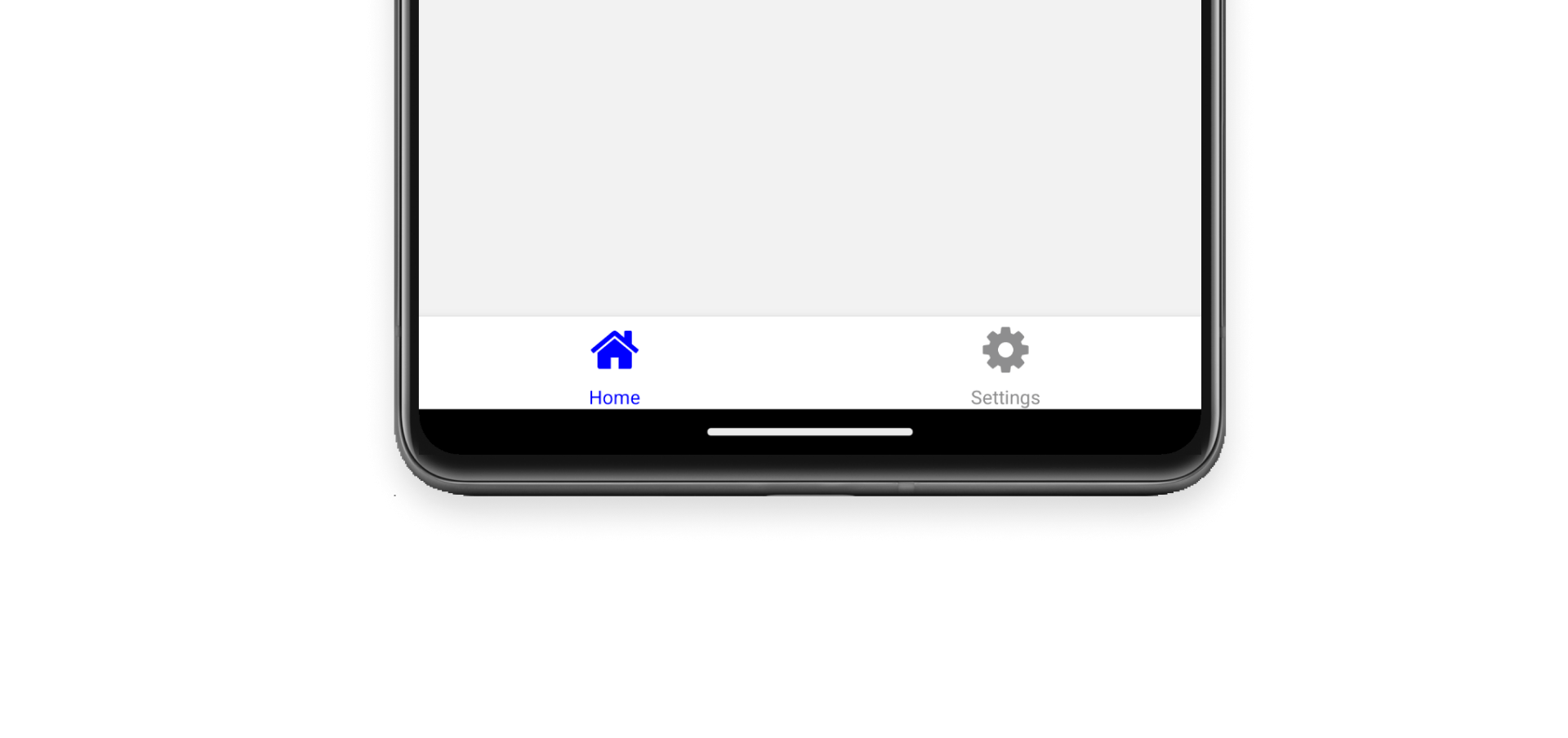
This file structure produces a layout with a tab bar at the bottom of the screen. The tab bar will have two tabs: Home and Settings:

You can use the app/_layout.tsx file to define your app's root layout:
app/_layout.tsx
Copy
import { Stack } from 'expo-router'; export default function Layout() { return ( <Stack> <Stack.Screen name="(tabs)" options={{ headerShown: false }} /> </Stack> ); }
The (tabs) directory is a special directory name that tells Expo Router to use the Tabs layout.
From the file structure, the (tabs) directory has three files. The first is (tabs)/_layout.tsx. This file is the main layout file for the tab bar and each tab. Inside it, you can control how the tab bar and each tab button look and behave.
app/(tabs)/_layout.tsx
Copy
import FontAwesome from '@expo/vector-icons/FontAwesome'; import { Tabs } from 'expo-router'; export default function TabLayout() { return ( <Tabs screenOptions={{ tabBarActiveTintColor: 'blue' }}> <Tabs.Screen name="index" options={{ title: 'Home', tabBarIcon: ({ color }) => <FontAwesome size={28} name="home" color={color} />, }} /> <Tabs.Screen name="settings" options={{ title: 'Settings', tabBarIcon: ({ color }) => <FontAwesome size={28} name="cog" color={color} />, }} /> </Tabs> ); }
Show More
Finally, you have the two tab files that make up the content of the tabs: app/(tabs)/index.tsx and app/(tabs)/settings.tsx.
app/(tabs)/index.tsx & app/(tabs)/settings.tsx
Copy
import { View, Text, StyleSheet } from 'react-native'; export default function Tab() { return ( <View style={styles.container}> <Text>Tab [Home|Settings]</Text> </View> ); } const styles = StyleSheet.create({ container: { flex: 1, justifyContent: 'center', alignItems: 'center', }, });
The tab file named index.tsx is the default tab when the app loads. The second tab file settings.tsx shows how you can add more tabs to the tab bar.
The JavaScript tabs in Expo Router extend the Bottom Tabs Navigator from React Navigation. The specific APIs available depend on your versions. For example, Expo Router v6 extends Bottom Tabs Navigator v7. Check your versions to ensure compatibility, then you can use the same configuration props to customize the bottom tab bar and individual tabs. For example:
app/(tabs)/_layout.tsx
Copy
import { Tabs } from 'expo-router'; export default function TabLayout() { return ( <Tabs screenOptions={ { // Here to apply for all tabs } }> <Tabs.Screen name="index" options={ { // Or here to apply for one tab } } /> </Tabs> ); }
Show More
The supported tab bar options are listed below:
| Option | Platform | Description |
| --- | --- | --- |
| tabBarAccessibilityLabel | Android<br><br>iOS | Accessibility label for the tab button. This is read by the screen reader when the user taps the tab. It's recommended to set this if you don't have a label for the tab. |
| tabBarActiveBackgroundColor | Android<br><br>iOS | Background color for the active tab. |
| tabBarActiveTintColor | Android<br><br>iOS | Color for the icon and label in the active tab. |
| tabBarBackground | Android<br><br>iOS | Function which returns a React Element to use as background for the tab bar. You could render an image, a gradient, blur view etc.:<br><br>import { BlurView } from 'expo-blur'; // ... <Tab.Navigator screenOptions={{ tabBarStyle: { position: 'absolute' }, tabBarBackground: () => ( <BlurView tint="light" intensity={100} style={StyleSheet.absoluteFill} /> ), }} ><br><br>When using BlurView, make sure to set position: 'absolute' in tabBarStyle as well. You'd also need to use useBottomTabBarHeight to add bottom padding to your content. |
| tabBarBadge | Android<br><br>iOS | Text to show in a badge on the tab icon. Accepts a string or a number. |
| tabBarBadgeStyle | Android<br><br>iOS | Style for the badge on the tab icon. You can specify a background color or text color here. |
| tabBarButton | Android<br><br>iOS | Function which returns a React element to render as the tab bar button. It wraps the icon and label. Renders Pressable by default.<br><br>You can specify a custom implementation here:<br><br>tabBarButton: (props) => <TouchableOpacity {...props} />; |
| tabBarButtonTestID | Android<br><br>iOS | ID to locate this tab button in tests. |
| tabBarHideOnKeyboard | Android<br><br>iOS | Whether the tab bar is hidden when the keyboard opens. Defaults to false. |
| tabBarIcon | Android<br><br>iOS | Function that given { focused: boolean, color: string, size: number } returns a React.Node, to display in the tab bar. |
| tabBarIconStyle | Android<br><br>iOS | Style object for the tab icon. |
| tabBarInactiveBackgroundColor | Android<br><br>iOS | Background color for the inactive tabs. |
| tabBarInactiveTintColor | Android<br><br>iOS | Color for the icon and label in the inactive tabs. |
| tabBarItemStyle | Android<br><br>iOS | Style object for the tab item container. |
| tabBarLabel | Android<br><br>iOS | Title string of a tab displayed in the tab bar or a function that given { focused: boolean, color: string } returns a React.Node, to display in tab bar. When undefined, scene title is used. To hide, see tabBarShowLabel. |
| tabBarLabelPosition | Android<br><br>iOS | Whether the label is shown below the icon or beside the icon.<br><br>By default, the position is chosen automatically based on device width.<br><br>* below-icon: the label is shown below the icon (typical for iPhones)<br> <br>* beside-icon the label is shown next to the icon (typical for iPad) |
| tabBarLabelStyle | Android<br><br>iOS | Style object for the tab label. |
| tabBarPosition | Android<br><br>iOS | Position of the tab bar. Available values are:<br><br>* bottom (Default)<br>* top<br>* left<br>* right<br><br>When the tab bar is positioned on the left or right, it is styled as a sidebar. This can be useful when you want to show a sidebar on larger screens and a bottom tab bar on smaller screens:<br><br><Tab.Navigator screenOptions={{ tabBarPosition: dimensions.width < 600 ? 'bottom' : 'left', tabBarLabelPosition: 'below-icon', }} > |
| tabBarShowLabel | Android<br><br>iOS | Whether the tab label should be visible. Defaults to true. |
| tabBarStyle | Android<br><br>iOS | Style object for the tab bar. You can configure styles such as background color here.<br><br>To show your screen under the tab bar, you can set the position style to absolute:<br><br><Tab.Navigator screenOptions={{ tabBarStyle: { position: 'absolute' }, }} ><br><br>You also might need to add a bottom margin to your content if you have an absolutely positioned tab bar. React Navigation won't do it automatically. See useBottomTabBarHeight for more details. |
| tabBarVariant | Android<br><br>iOS | Variant of the tab bar. Available values are:<br><br>* uikit (Default) - The tab bar will be styled according to the iOS UIKit guidelines.<br>* material - The tab bar will be styled according to the Material Design guidelines.<br><br>The material variant is currently only supported when the tabBarPosition is set to left or right. |
For additional details and navigator-specific examples, see React Navigation's Bottom Tabs Navigator documentation .
Hiding a tab
Sometimes you want a route to exist but not show up in the tab bar. You can pass href: null to disable the button:
app/(tabs)/_layout.tsx
Copy
import { Tabs } from 'expo-router'; export default function TabLayout() { return ( <Tabs> <Tabs.Screen name="index" options={{ href: null, }} /> </Tabs> ); }
Dynamic routes
You can use a dynamic route in a tab bar. For example, you have a [user] tab that shows a user's profile. You can use the href option to link to a specific user's profile.
app/(tabs)/_layout.tsx
Copy
import { Tabs } from 'expo-router'; export default function TabLayout() { return ( <Tabs> <Tabs.Screen // Name of the dynamic route. name="[user]" options={{ // Ensure the tab always links to the same href. href: '/evanbacon', // OR you can use the href object. href: { pathname: '/[user]', params: { user: 'evanbacon', }, }, }} /> </Tabs> ); }
Show More
Note: When adding a dynamic route in your tab layout, ensure that the dynamic route defined is unique. You cannot have two screens for the same dynamic route. For example, you cannot have two
[user]tabs. If you need to have multiple dynamic routes, create a custom navigator.
