📄 expo/router/reference/link-preview
File: link-preview.md | Updated: 11/15/2025
Source: https://docs.expo.dev/router/reference/link-preview
Hide navigation
Search
Ctrl K
Home Guides EAS Reference Learn
Archive Expo Snack Discord and Forums Newsletter
Link preview
Copy page
Learn how to add a preview to your link on iOS when using Expo Router.
Copy page
Link preview is an iOS-only feature available in SDK 54 and later.
Link preview (also known as "Peek and Pop") is a feature commonly used on iOS to show users a preview popup of the screen for a link. This guide will show you how to add and customize a link preview for your app on iOS.
If you have a link in your app, you can add a link preview to it by replacing the link's content with a Link.Trigger
and adding the Link.Preview
component to it. This will create a preview of the page that the link points to.
import { Link } from 'expo-router'; export default function Page() { return ( <Link href="/about"> <Link.Trigger>About</Link.Trigger> <Link.Preview /> </Link> ); }
By default, the link preview is rendered as a full-sized page snapshot. There are several ways to customize this behavior.
Custom size
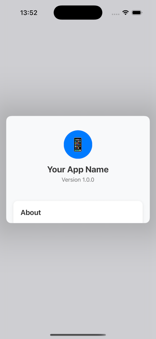
You can use width and height to suggest a preferred preview size. The system will consider these preferences but may override them based on available space or platform behavior.
<Link href="..."> <Link.Trigger>Content</Link.Trigger> <Link.Preview style={{ width: 300, height: 200 }} /> </Link>
The following example shows a custom link preview size on iOS:

Custom preview
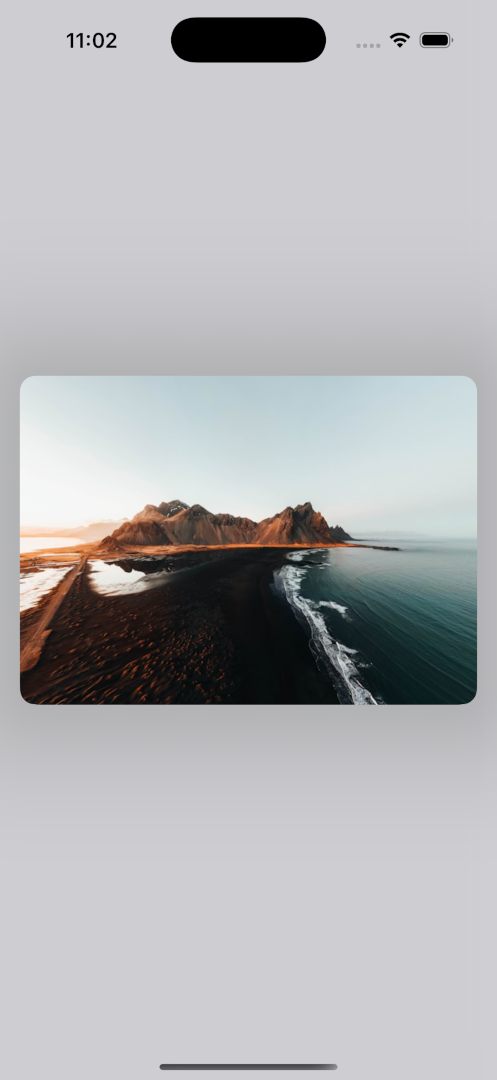
If you don't want to show the default preview, you can pass custom content to the Link.Preview component via children. This custom content will replace the default preview of the link target.
export default function Page() { const [imageSize, setImageSize] = useState({ width: 0, height: 0 }); const { width } = useWindowDimensions(); const previewHeight = (width / imageSize.width) * imageSize.height; return ( <Link href="/about"> <Link.Trigger>About</Link.Trigger> <Link.Trigger>Content</Link.Trigger> <Link.Preview style={{ width, height: previewHeight }}> <Image onLoad={e => setImageSize(e.nativeEvent.source)} source={source} style={{ width: '100%', height: '100%' }} /> </Link.Preview> </Link> ); }
Show More
The following example shows a custom link preview on iOS:

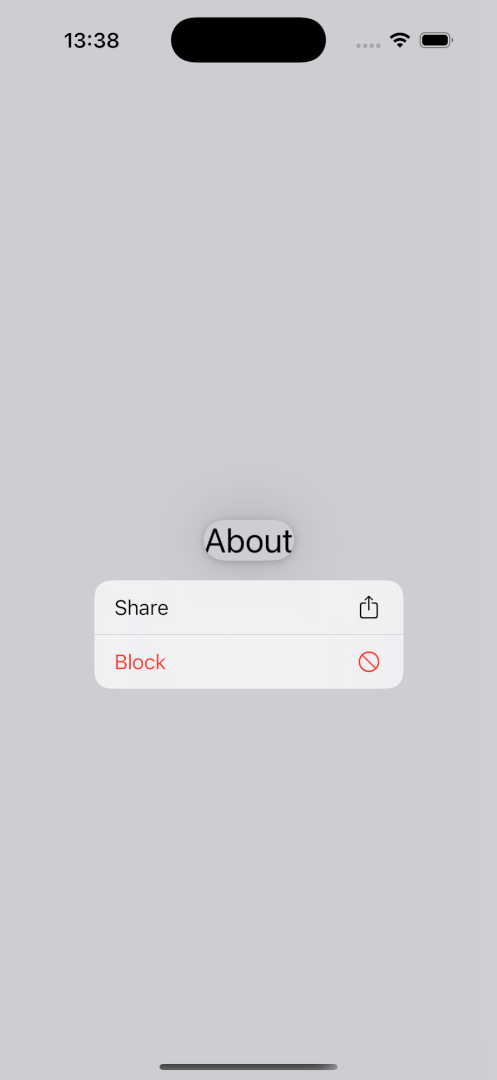
To render a context menu next to the preview, add a Link.Menu
with Link.MenuAction
children.
<Link href="/about"> <Link.Trigger>About</Link.Trigger> <Link.Menu> <Link.MenuAction title="Share" icon="square.and.arrow.up" onPress={handleSharePress} /> <Link.MenuAction title="Block" icon="nosign" destructive onPress={handleBlockPress} /> </Link.Menu> </Link>
The following example shows a custom link preview on iOS:

Icons
You can specify an icon for each menu action using SF Symbols .
<Link href="/about"> <Link.Trigger>About</Link.Trigger> <Link.Menu> <Link.MenuAction title="Share" icon="square.and.arrow.up" onPress={handleSharePress} /> <Link.MenuAction title="Block" icon="nosign" onPress={handleBlockPress} /> <Link.MenuAction title="Follow" icon="person.crop.circle.badge.plus" onPress={handleFollowPress} /> <Link.MenuAction title="Copy" icon="doc.on.doc" onPress={handleCopyPress} /> </Link.Menu> </Link>
The following example shows a context menu with four elements, each using a different icon on iOS:
![]()
Nested menus
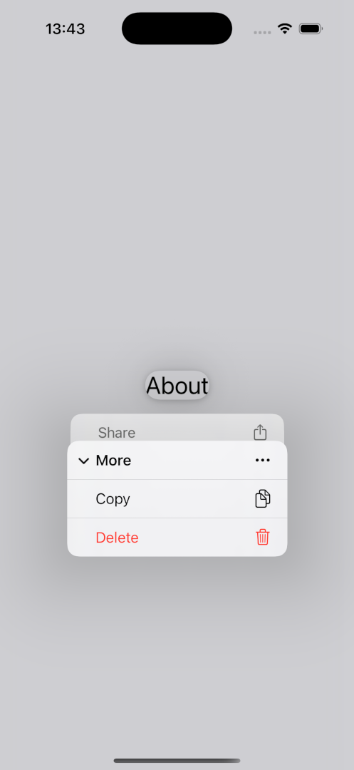
You can nest menus by placing a Link.Menu
inside another menu:
<Link href="..."> <Link.Trigger>About</Link.Trigger> <Link.Menu> <Link.MenuAction title="Share" icon="square.and.arrow.up" onPress={() => {}} /> <Link.Menu title="More" icon="ellipsis"> <Link.MenuAction title="Copy" icon="doc.on.doc" onPress={() => {}} /> <Link.MenuAction title="Delete" icon="trash" destructive onPress={() => {}} /> </Link.Menu> </Link.Menu> </Link>
The following example shows a nested context menu on iOS:

More customization options
To explore all available customization options, see the API documentation for Link.MenuAction
.
Detecting if component is in preview
If you're building a component that might be rendered inside a preview, you can use the useIsPreview()
hook to adjust its behavior accordingly:
function MyComponent() { // This will be true if component/screen is being rendered inside a preview const isInsidePreview = useIsPreview(); return isInsidePreview ? <Text>From within preview</Text> : <Text>I am outside of preview</Text>; }
replace not supported
Using link previews with replace
mode is currently not supported. Previews can only be used with the default push
navigation mode.
JavaScript tabs and slots
When navigating within JavaScript tabs (rather than native tabs) or Slot
, preview transition animations may appear clunky. This is due to React's delayed rendering while the native preview animation begins immediately. To prevent this issues use, native tabs and stack navigators.
Missing Link.Trigger
If you render a Link with a preview or context menu, but without a Link.Trigger, an exception will be thrown. The same applies if you place any non-Link.* component directly inside Link when using preview mode.
Multiple Link.Trigger children with asChild prop
When using Link with asChild, you may only specify one child for Link.Trigger. The onPress event will be forwarded to that child only.
Changing href while preview is open
Changing href prop's path dynamically while the preview is open is not supported. You may only modify the query parameters dynamically.