📄 expo/versions/latest/sdk/checkbox
File: checkbox.md | Updated: 11/15/2025
Source: https://docs.expo.dev/versions/latest/sdk/checkbox
Hide navigation
Search
Ctrl K
Home Guides EAS Reference Learn
Reference version
SDK 54 (latest)
Archive Expo Snack Discord and Forums Newsletter
Expo Checkbox
Ask AI
A universal React component that provides basic checkbox functionality.
Ask AI
Android
iOS
tvOS
Web
Bundled version:
~5.0.7
Copy page
expo-checkbox provides a basic boolean input element for all platforms.
Terminal
Copy
- npx expo install expo-checkbox
Basic Checkbox usage
Copy
Open in Snack
import { Checkbox } from 'expo-checkbox'; import { useState } from 'react'; import { StyleSheet, Text, View } from 'react-native'; export default function App() { const [isChecked, setChecked] = useState(false); return ( <View style={styles.container}> <View style={styles.section}> <Checkbox style={styles.checkbox} value={isChecked} onValueChange={setChecked} /> <Text style={styles.paragraph}>Normal checkbox</Text> </View> <View style={styles.section}> <Checkbox style={styles.checkbox} value={isChecked} onValueChange={setChecked} color={isChecked ? '#4630EB' : undefined} /> <Text style={styles.paragraph}>Custom colored checkbox</Text> </View> <View style={styles.section}> <Checkbox style={styles.checkbox} disabled value={isChecked} onValueChange={setChecked} /> <Text style={styles.paragraph}>Disabled checkbox</Text> </View> </View> ); } const styles = StyleSheet.create({ container: { flex: 1, marginHorizontal: 16, marginVertical: 32, }, section: { flexDirection: 'row', alignItems: 'center', }, paragraph: { fontSize: 15, }, checkbox: { margin: 8, }, });
Show More
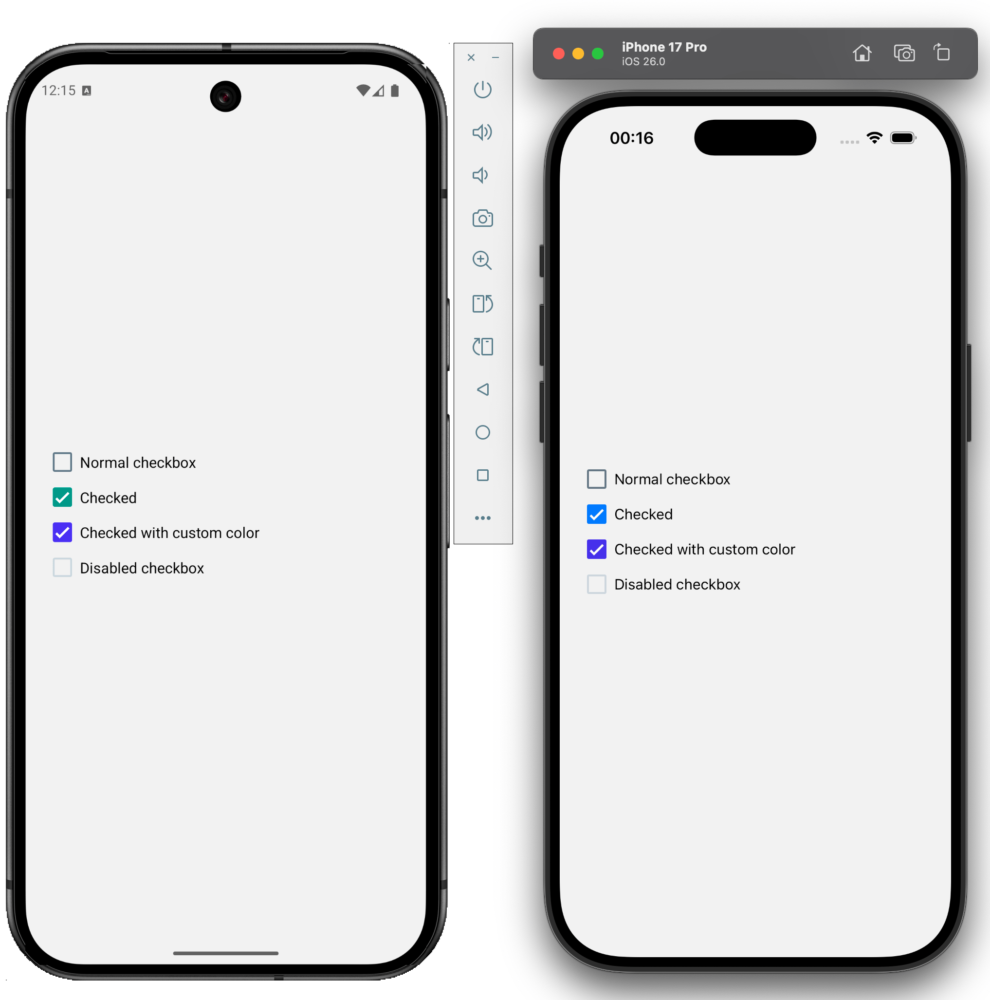
An example of how expo-checkbox appears on Android and iOS is shown below:
import { Checkbox } from 'expo-checkbox';
Checkbox
Android
iOS
tvOS
Web
Type: React.[Element](https://www.typescriptlang.org/docs/handbook/jsx.html#function-component) <[CheckboxProps](https://docs.expo.dev/versions/latest/sdk/checkbox#checkboxprops) >
color
Android
iOS
tvOS
Web
Optional • Type: [ColorValue](https://reactnative.dev/docs/colors)
The tint or color of the checkbox. This overrides the disabled opaque style.
disabled
Android
iOS
tvOS
Web
Optional • Type: boolean
If the checkbox is disabled, it becomes opaque and uncheckable.
onChange
Android
iOS
tvOS
Web
Optional • Type: (event: NativeSyntheticEvent<[CheckboxEvent](https://docs.expo.dev/versions/latest/sdk/checkbox#checkboxevent) > | [SyntheticEvent](https://react.dev/reference/react-dom/components/common#react-event-object) <[HTMLInputElement](https://developer.mozilla.org/en-US/docs/Web/API/HTMLInputElement) , [CheckboxEvent](https://docs.expo.dev/versions/latest/sdk/checkbox#checkboxevent) >) => void
Callback that is invoked when the user presses the checkbox.
event: NativeSyntheticEvent<[CheckboxEvent](https://docs.expo.dev/versions/latest/sdk/checkbox#checkboxevent) > | [SyntheticEvent](https://react.dev/reference/react-dom/components/common#react-event-object) <[HTMLInputElement](https://developer.mozilla.org/en-US/docs/Web/API/HTMLInputElement) , [CheckboxEvent](https://docs.expo.dev/versions/latest/sdk/checkbox#checkboxevent) >
A native event containing the checkbox change.
onValueChange
Android
iOS
tvOS
Web
Optional • Type: (value: boolean) => void
Callback that is invoked when the user presses the checkbox.
value: boolean
A boolean indicating the new checked state of the checkbox.
value
Android
iOS
tvOS
Web
Optional • Type: boolean • Default: false
Value indicating if the checkbox should be rendered as checked or not.
Inherited Props
[ViewProps](https://reactnative.dev/docs/view#props)
CheckboxEvent
Android
iOS
tvOS
Web
| Property | Type | Description |
| --- | --- | --- |
| target | any | On native platforms, a NodeHandle for the element on which the event has occurred. On web, a DOM node on which the event has occurred. |
| value | boolean | A boolean representing checkbox current value. |