📄 expo/versions/latest/sdk/ui/jetpack-compose
File: jetpack-compose.md | Updated: 11/15/2025
Source: https://docs.expo.dev/versions/latest/sdk/ui/jetpack-compose
Hide navigation
Search
Ctrl K
Home Guides EAS Reference Learn
Reference version
SDK 54 (latest)
Archive Expo Snack Discord and Forums Newsletter
Jetpack Compose
Ask AI
Jetpack Compose components for building native Android interfaces with @expo/ui.
Ask AI
Android
Bundled version:
~0.2.0-beta.7
Copy page
This library is currently in alpha and will frequently experience breaking changes. It is not available in the Expo Go app — use development builds to try it out.
The Jetpack Compose components in @expo/ui/jetpack-compose allow you to build fully native Android interfaces using Jetpack Compose from React Native.
Terminal
Copy
- npx expo install @expo/ui
If you are installing this in an existing React Native app
, make sure to install expo
in your project.
Button
Android
Code
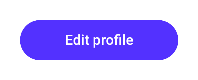
import { Button } from '@expo/ui/jetpack-compose'; <Button style={{ flex: 1 }} variant="default" onPress={() => { setEditingProfile(true); }}> Edit profile </Button>
_See also: official Jetpack Compose documentation _
CircularProgress
Android
Code

import { CircularProgress } from '@expo/ui/jetpack-compose'; <CircularProgress progress={0.5} style={{ width: 300 }} color="blue" elementColors={{ trackColor: '#cccccc' }} />
_See also: official Jetpack Compose documentation _
ContextMenu
Note: Also known as DropdownMenu.
Android
Code
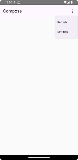
import { ContextMenu } from '@expo/ui/jetpack-compose'; <ContextMenu style={{ width: 150, height: 50 }}> <ContextMenu.Items> <Button elementColors={{ containerColor: '#0000ff', contentColor: '#00ff00' }} onPress={() => console.log('Pressed1')}> Hello </Button> <Button variant="bordered" color="#ff0000" onPress={() => console.log('Pressed2')}> Love it </Button> <Picker label="Doggos" options={['very', 'veery', 'veeery', 'much']} variant="menu" selectedIndex={selectedIndex} onOptionSelected={({ nativeEvent: { index } }) => setSelectedIndex(index)} /> </ContextMenu.Items> <ContextMenu.Trigger> <Button variant="bordered" style={{ width: 150, height: 50 }}> Show Menu </Button> </ContextMenu.Trigger> </ContextMenu>
Show More
_See also: official Jetpack Compose documentation _
Chip
Android
Code
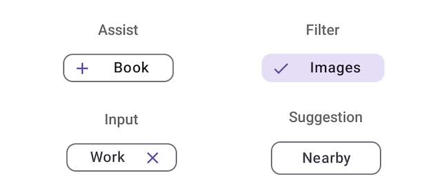
import { Chip } from '@expo/ui/jetpack-compose'; // Assist chip with icon <Chip variant="assist" label="Book" leadingIcon="filled.Add" onPress={() => console.log('Opening flight booking...')} /> // Filter chip with selection <Chip variant="filter" label="Images" leadingIcon="filled.Star" selected={selectedFilters.includes('Images')} onPress={() => handleFilterToggle('Images')} /> // Input chip with dismiss <Chip variant="input" label="Work" leadingIcon="filled.Create" onDismiss={() => handleInputDismiss('Work')} /> // Suggestion chip <Chip variant="suggestion" label="Nearby" leadingIcon="filled.LocationOn" onPress={() => console.log('Searching nearby...')} />
Show More
_See also: official Jetpack Compose documentation _
DateTimePicker (date)
Android
Code
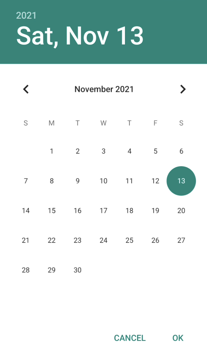
import { DateTimePicker } from '@expo/ui/jetpack-compose'; <DateTimePicker onDateSelected={date => { setSelectedDate(date); }} displayedComponents='date' initialDate={selectedDate.toISOString()} variant='picker' />
_See also: official Jetpack Compose documentation _
DateTimePicker (time)
Android
Code
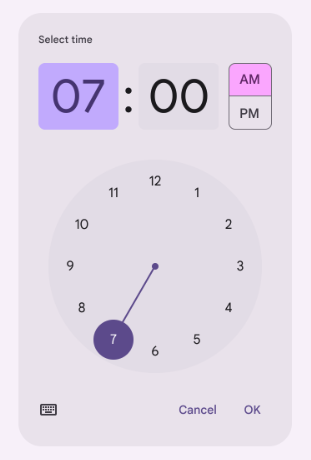
import { DateTimePicker } from '@expo/ui/jetpack-compose'; <DateTimePicker onDateSelected={date => { setSelectedDate(date); }} displayedComponents='hourAndMinute' initialDate={selectedDate.toISOString()} variant='picker' />
_See also: official Jetpack Compose documentation _
LinearProgress
Android
Code

import { LinearProgress } from '@expo/ui/jetpack-compose'; <LinearProgress progress={0.5} style={{ width: 300 }} color="red" />
_See also: official Jetpack Compose documentation _
Picker (radio)
Android
Code
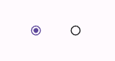
import { Picker } from '@expo/ui/jetpack-compose'; <Picker options={['$', '$$', '$$$', '$$$$']} selectedIndex={selectedIndex} onOptionSelected={({ nativeEvent: { index } }) => { setSelectedIndex(index); }} variant="radio" />
_See also: official Jetpack Compose documentation _
Picker (segmented)
Android
Code
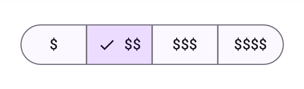
import { Picker } from '@expo/ui/jetpack-compose'; <Picker options={['$', '$$', '$$$', '$$$$']} selectedIndex={selectedIndex} onOptionSelected={({ nativeEvent: { index } }) => { setSelectedIndex(index); }} variant="segmented" />
_See also: official Jetpack Compose documentation _
Slider
Android
Code
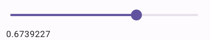
import { Slider } from '@expo/ui/jetpack-compose'; <Slider style={{ minHeight: 60 }} value={value} onValueChange={(value) => { setValue(value); }} />
_See also: official Jetpack Compose documentation _
Switch (toggle)
Note: also known as Toggle.
Android
Code

import { Switch } from '@expo/ui/jetpack-compose'; <Switch value={checked} onValueChange={checked => { setChecked(checked); }} color="#ff0000" label="Play music" variant="switch" />
_See also: official Jetpack Compose documentation _
Switch (checkbox)
Android
Code
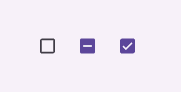
import { Switch } from '@expo/ui/jetpack-compose'; <Switch value={checked} onValueChange={checked => { setChecked(checked); }} label="Play music" color="#ff0000" variant="checkbox" />
_See also: official Jetpack Compose documentation _
TextInput
Android
Code

import { TextInput } from '@expo/ui/jetpack-compose'; <TextInput autocorrection={false} defaultValue="A single line text input" onChangeText={setValue} />
_See also: official Jetpack Compose documentation _
Full documentation is not yet available. Use TypeScript types to explore the API.
// Import from the Jetpack Compose package import { Button } from '@expo/ui/jetpack-compose';