📄 expo/versions/v53.0.0/sdk/symbols
File: symbols.md | Updated: 11/15/2025
Source: https://docs.expo.dev/versions/v53.0.0/sdk/symbols
Hide navigation
Search
Ctrl K
Home Guides EAS Reference Learn
Reference version
SDK 53
Archive Expo Snack Discord and Forums Newsletter
 Expo Symbols
A library that allows access to native symbols.
iOS
tvOS
Bundled version:
~0.4.5
Copy page
This library is currently in beta and subject to breaking changes.
expo-symbols provides access to the SF Symbols
library on iOS.
Terminal
Copy
- npx expo install expo-symbols
If you are installing this in an existing React Native app
, make sure to install expo
in your project.
App.js
Copy
import { SymbolView, SymbolViewProps, SFSymbol } from 'expo-symbols'; import { StyleSheet, View } from 'react-native'; export default function App() { return ( <View style={styles.container}> <SymbolView name="airpods.chargingcase" style={styles.symbol} type="hierarchical" /> </View> ); } const styles = StyleSheet.create({ container: { flex: 1, backgroundColor: '#fff', alignItems: 'center', justifyContent: 'center', }, symbol: { width: 35, height: 35, margin: 5, }, });
Show More
import { SymbolView } from 'expo-symbols';
SymbolView
Type: React.[Element](https://www.typescriptlang.org/docs/handbook/jsx.html#function-component) <[SymbolViewProps](https://docs.expo.dev/versions/v53.0.0/sdk/symbols#symbolviewprops) >
animationSpec
Optional • Type: [AnimationSpec](https://docs.expo.dev/versions/v53.0.0/sdk/symbols#animationspec)
The animation configuration to apply to the symbol.
colors
Optional • Literal type: union
An array of colors to use when the SymbolType
is palette.
Acceptable values are: [ColorValue](https://reactnative.dev/docs/colors) | [ColorValue[]](https://reactnative.dev/docs/colors)
fallback
Optional • Type: React.ReactNode
Fallback to render on Android and Web where SF Symbols are not available.
name
Type: [SFSymbol](https://github.com/nandorojo/sf-symbols-typescript)
The name of the symbol. Symbols can be viewed in the Apple SF Symbols app .
resizeMode
Optional • Type: [ContentMode](https://docs.expo.dev/versions/v53.0.0/sdk/symbols#contentmode) • Default: 'scaleToAspectFit'
Determines how the image should be resized to fit its container.
scale
Optional • Type: [SymbolScale](https://docs.expo.dev/versions/v53.0.0/sdk/symbols#symbolscale) • Default: 'unspecified'
The scale of the symbol to render.
size
Optional • Type: number • Default: 24
The size of the symbol.
tintColor
Optional • Type: [ColorValue](https://reactnative.dev/docs/colors)
The tint color to apply to the symbol.
type
Optional • Type: [SymbolType](https://docs.expo.dev/versions/v53.0.0/sdk/symbols#symboltype) • Default: 'monochrome'
Determines the symbol variant to use.
weight
Optional • Type: [SymbolWeight](https://docs.expo.dev/versions/v53.0.0/sdk/symbols#symbolweight) • Default: 'unspecified'
The weight of the symbol to render.
Inherited Props
[ViewProps](https://reactnative.dev/docs/view#props)
AnimationEffect
| Property | Type | Description |
| --- | --- | --- |
| direction(optional) | 'up' \| 'down' | The direction of the animation. |
| type | [AnimationType](https://docs.expo.dev/versions/v53.0.0/sdk/symbols#animationtype) | The type of animation to apply to the symbol. |
| wholeSymbol(optional) | boolean | Whether the entire symbol should animate or just the individual layers.<br><br>Default:false |
AnimationSpec
The animation configuration to apply to the symbol.
| Property | Type | Description |
| --- | --- | --- |
| effect(optional) | [AnimationEffect](https://docs.expo.dev/versions/v53.0.0/sdk/symbols#animationeffect) | The effect to apply to the symbol. |
| repeatCount(optional) | number | The number of times the animation should repeat. |
| repeating(optional) | boolean | If the animation should repeat. |
| speed(optional) | number | The duration of the animation in seconds. |
| variableAnimationSpec(optional) | [VariableAnimationSpec](https://docs.expo.dev/versions/v53.0.0/sdk/symbols#variableanimationspec) | An object that specifies how the symbol’s layers should animate. |
AnimationType
Literal Type: string
The type of animation to apply to the symbol.
Acceptable values are: 'bounce' | 'pulse' | 'scale'
ContentMode
Literal Type: string
Determines how the image should be resized to fit its container.
Acceptable values are: 'scaleToFill' | 'scaleAspectFit' | 'scaleAspectFill' | 'redraw' | 'center' | 'top' | 'bottom' | 'left' | 'right' | 'topLeft' | 'topRight' | 'bottomLeft' | 'bottomRight'
SymbolScale
Literal Type: string
The scale of the symbol to render.
Acceptable values are: 'default' | 'unspecified' | 'small' | 'medium' | 'large'
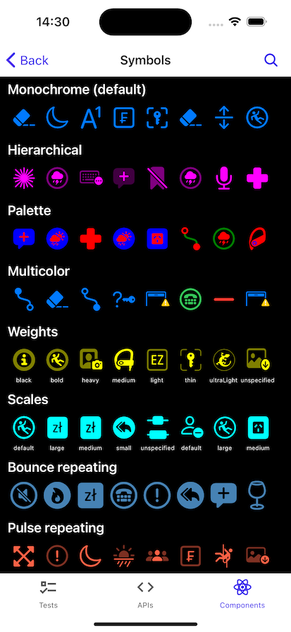
SymbolType
Literal Type: string
Determines the symbol variant to use.
-
'monochrome'- Creates a color configuration that specifies that the symbol image uses its monochrome variant. -
'hierarchical'- Creates a color configuration with a color scheme that originates from one color. -
'palette'- Creates a color configuration with a color scheme from a palette of multiple colors. -
'multicolor'- Creates a color configuration that specifies that the symbol image uses its multicolor variant, if one exists.
Acceptable values are: 'monochrome' | 'hierarchical' | 'palette' | 'multicolor'
SymbolWeight
Literal Type: string
The weight of the symbol to render.
Acceptable values are: 'unspecified' | 'ultraLight' | 'thin' | 'light' | 'regular' | 'medium' | 'semibold' | 'bold' | 'heavy' | 'black'
VariableAnimationSpec
A variable color animation draws attention to a symbol by changing the opacity of the symbol’s layers. You can choose to apply the effect to layers either cumulatively or iteratively. For cumulative animations, each layer’s opacity remains changed until the end of the animation cycle. For iterative animations, each layer’s opacity changes briefly before returning to its original state. These effects are compounding, each value set to true will add an additional effect.
| Property | Type | Description |
| --- | --- | --- |
| cumulative(optional) | boolean | This effect enables each successive variable layer, and the layer remains enabled until the end of the animation cycle. This effect cancels the iterative variant. |
| dimInactiveLayers(optional) | boolean | An effect that dims inactive layers of a symbol. This effect draws inactive layers with reduced, but nonzero, opacity. |
| hideInactiveLayers(optional) | boolean | An effect that hides inactive layers of a symbol. This effect hides inactive layers completely, rather than drawing them with reduced, but nonzero, opacity. |
| iterative(optional) | boolean | An effect that momentarily enables each layer of a symbol in sequence. |
| nonReversing(optional) | boolean | An effect that doesn’t reverse each time it repeats. |
| reversing(optional) | boolean | An effect that reverses each time it repeats. |