📄 expo/versions/v54.0.0/sdk/ui/swift-ui
File: swift-ui.md | Updated: 11/15/2025
Source: https://docs.expo.dev/versions/v54.0.0/sdk/ui/swift-ui
Hide navigation
Search
Ctrl K
Home Guides EAS Reference Learn
Reference version
SDK 54
Archive Expo Snack Discord and Forums Newsletter
SwiftUI
SwiftUI components for building native iOS interfaces with @expo/ui.
iOS
tvOS
Bundled version:
~0.2.0-beta.7
Copy page
This library is currently in beta and subject to breaking changes. It is not available in the Expo Go app — use development builds to try it out.
The SwiftUI components in @expo/ui/swift-ui allow you to build fully native iOS interfaces using SwiftUI from React Native.
Terminal
Copy
- npx expo install @expo/ui
If you are installing this in an existing React Native app
, make sure to install expo
in your project.
Using a component from @expo/ui/swift-ui requires wrapping it in a Host
component. The Host is a container for SwiftUI views.
import { Host, Button } from '@expo/ui/swift-ui'; export function SaveButton() { return ( <Host style={{ flex: 1 }}> <Button variant="default">Save changes</Button> </Host> ); }
For an in-depth explanation of how Host works, see the following resources:
Expo UI guide for Swift UI
Learn about the basics of @expo/ui/swift-ui

Expo UI iOS Liquid Glass Tutorial
Learn how to build real SwiftUI views in your React Native app with the new Expo UI.
BottomSheet
iOS
Code
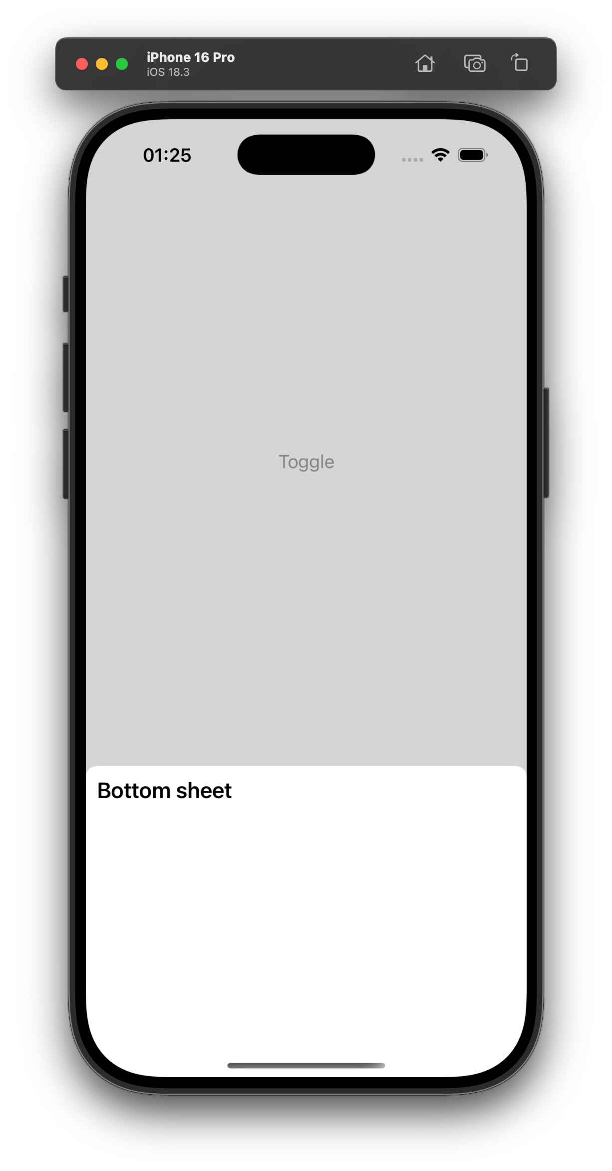
import { BottomSheet, Host, Text } from '@expo/ui/swift-ui'; import { useWindowDimensions } from 'react-native'; const { width } = useWindowDimensions(); <Host style={{ position: 'absolute', width }}> <BottomSheet isOpened={isOpened} onIsOpenedChange={e => setIsOpened(e)}> <Text>Hello, world!</Text> </BottomSheet> </Host>
_See also: official SwiftUI documentation _
Button
The borderless variant is not available on Apple TV.
iOS
Code

import { Button, Host } from '@expo/ui/swift-ui'; <Host style={{ flex: 1 }}> <Button variant="default" onPress={() => { setEditingProfile(true); }}> Edit profile </Button> </Host>
_See also: official SwiftUI documentation _
CircularProgress
iOS
Code

import { CircularProgress, Host } from '@expo/ui/swift-ui'; <Host style={{ width: 300 }}> <CircularProgress progress={0.5} color="blue" /> </Host>
_See also: official SwiftUI documentation _
ColorPicker
This component is not available on Apple TV.
iOS
Code
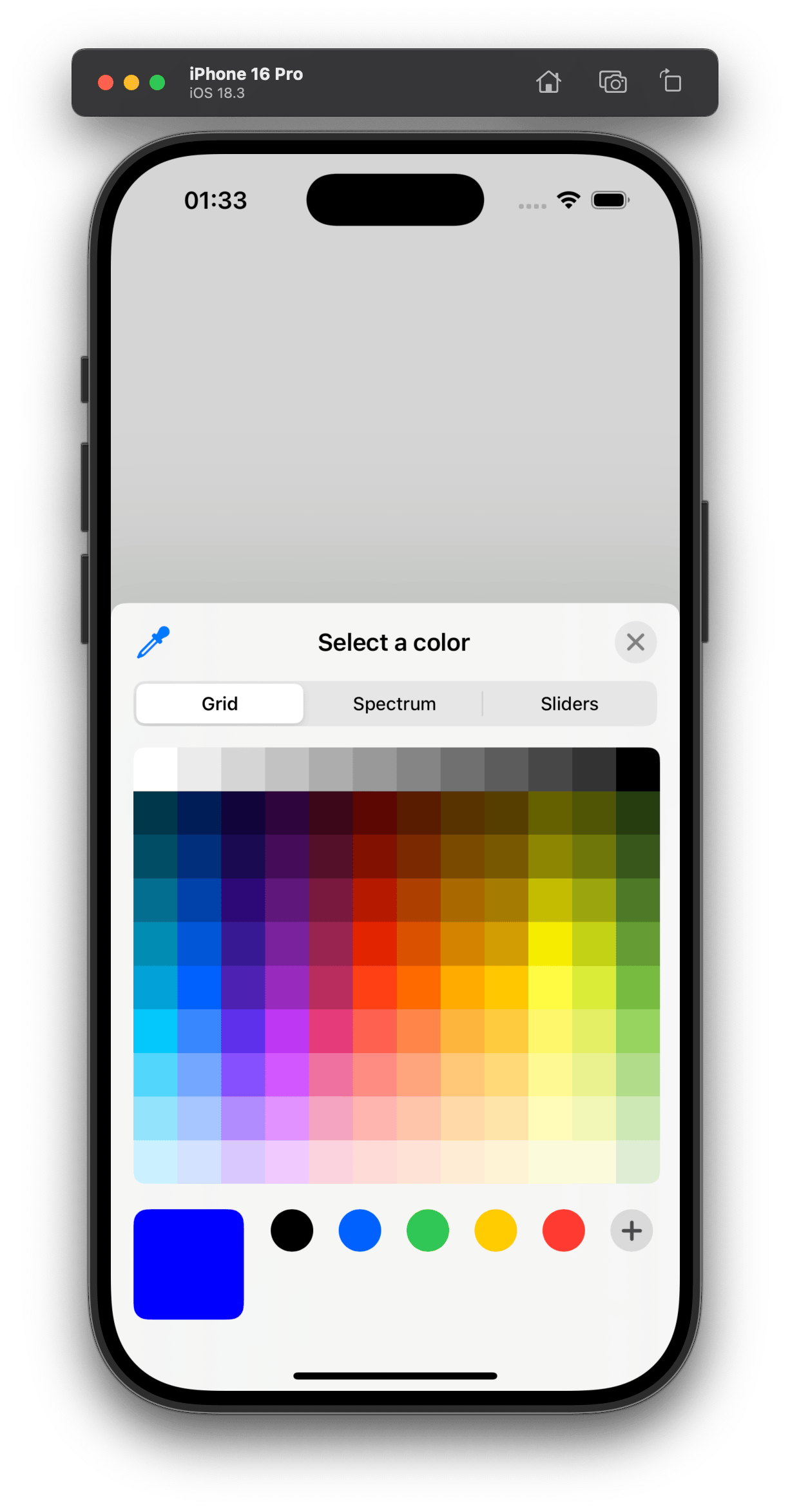
import { ColorPicker, Host } from '@expo/ui/swift-ui'; <Host style={{ width: 400, height: 200 }}> <ColorPicker label="Select a color" selection={color} onValueChanged={setColor} /> </Host>
_See also: official SwiftUI documentation _
ContextMenu
Note: Also known as DropdownMenu.
iOS
Code
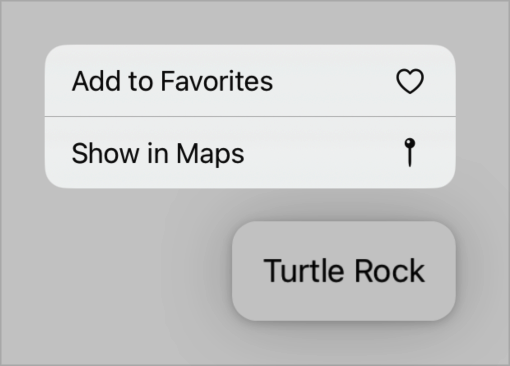
import { ContextMenu, Host } from '@expo/ui/swift-ui'; <Host style={{ width: 150, height: 50 }}> <ContextMenu> <ContextMenu.Items> <Button systemImage="person.crop.circle.badge.xmark" onPress={() => console.log('Pressed1')}> Hello </Button> <Button variant="bordered" systemImage="heart" onPress={() => console.log('Pressed2')}> Love it </Button> <Picker label="Doggos" options={['very', 'veery', 'veeery', 'much']} variant="menu" selectedIndex={selectedIndex} onOptionSelected={({ nativeEvent: { index } }) => setSelectedIndex(index)} /> </ContextMenu.Items> <ContextMenu.Trigger> <Button variant="bordered"> Show Menu </Button> </ContextMenu.Trigger> </ContextMenu> </Host>
Show More
_See also: official SwiftUI documentation _
DateTimePicker (date)
This component is not available on Apple TV.
iOS
Code
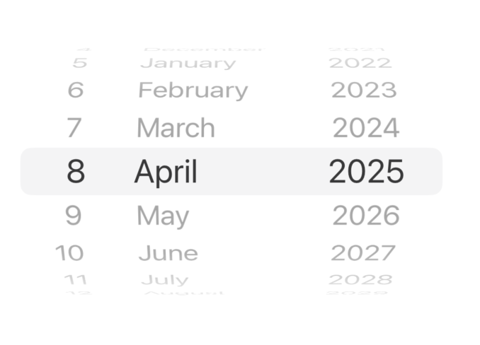
import { DateTimePicker, Host } from '@expo/ui/swift-ui'; <Host matchContents> <DateTimePicker onDateSelected={date => { setSelectedDate(date); }} displayedComponents='date' initialDate={selectedDate.toISOString()} variant='wheel' /> </Host>
_See also: official SwiftUI documentation _
DateTimePicker (time)
This component is not available on Apple TV.
iOS
Code
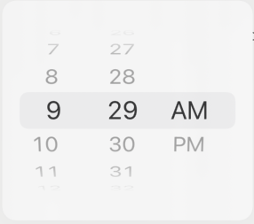
import { DateTimePicker, Host } from '@expo/ui/swift-ui'; <Host matchContents> <DateTimePicker onDateSelected={date => { setSelectedDate(date); }} displayedComponents='hourAndMinute' initialDate={selectedDate.toISOString()} variant='wheel' /> </Host>
_See also: official SwiftUI documentation _
Gauge
This component is not available on Apple TV.
iOS
Code
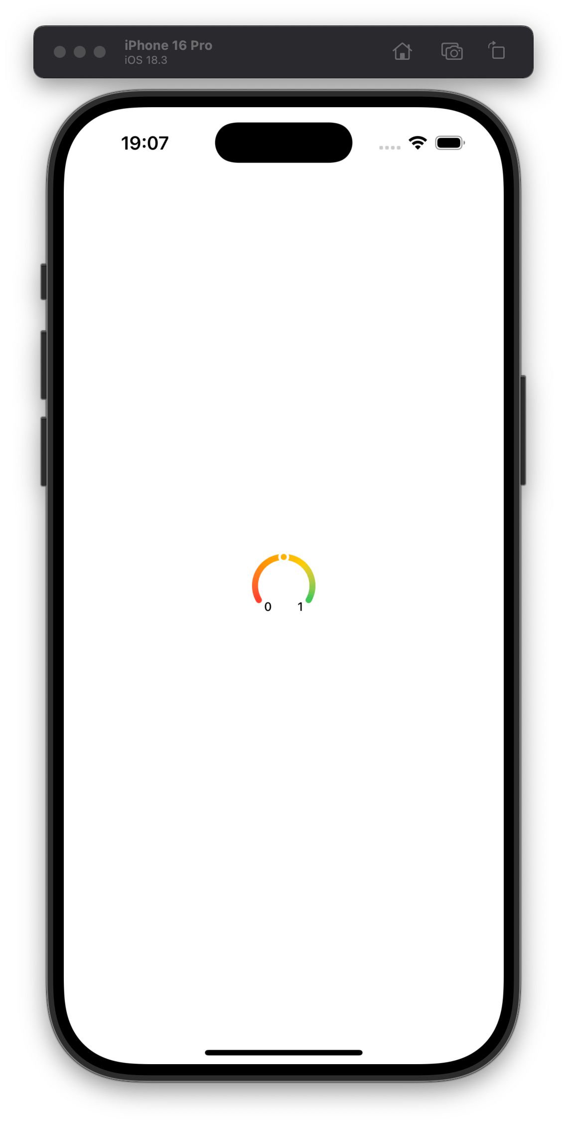
import { Gauge, Host } from "@expo/ui/swift-ui"; <Host matchContents> <Gauge max={{ value: 1, label: '1' }} min={{ value: 0, label: '0' }} current={{ value: 0.5 }} color={[ PlatformColor('systemRed'), PlatformColor('systemOrange'), PlatformColor('systemYellow'), PlatformColor('systemGreen'), ]} type="circularCapacity" /> </Host>
_See also: official SwiftUI documentation _
Host
A component that allows you to put the other @expo/ui/swift-ui components in React Native. It acts like <svg>
for DOM, <Canvas>
for react-native-skia
, which underlying uses UIHostingController
to render the SwiftUI views in UIKit.
Since the Host component is a React Native View
, you can pass the style
prop to it or matchContents prop to make the Host component match the contents' size.
Wrapping Button in Host
Copy
import { Button, Host } from '@expo/ui/swift-ui'; function Example() { return ( <Host matchContents> <Button onPress={() => { console.log('Pressed'); }}> Click </Button> </Host> ); }
Host with flexbox and VStack
Copy
import { Button, Host, VStack, Text } from '@expo/ui/swift-ui'; function Example() { return ( <Host style={{ flex: 1 }}> <VStack spacing={8}> <Text>Hello, world!</Text> <Button onPress={() => { console.log('Pressed'); }}> Click </Button> </VStack> </Host> ); }
LinearProgress
iOS
Code

import { LinearProgress, Host } from '@expo/ui/swift-ui'; <Host style={{ width: 300 }}> <LinearProgress progress={0.5} color="red" /> </Host>
_See also: official SwiftUI documentation _
List
iOS
Code
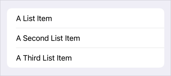
import { Host, List } from '@expo/ui/swift-ui'; <Host style={{ flex: 1 }}> <List scrollEnabled={false} editModeEnabled={editModeEnabled} onSelectionChange={(items) => alert(`indexes of selected items: ${items.join(', ')}`)} moveEnabled={moveEnabled} onMoveItem={(from, to) => alert(`moved item at index ${from} to index ${to}`)} onDeleteItem={(item) => alert(`deleted item at index: ${item}`)} listStyle='automatic' deleteEnabled={deleteEnabled} selectEnabled={selectEnabled}> {data.map((item, index) => ( <LabelPrimitive key={index} title={item.text} systemImage={item.systemImage} color={color} /> ))} </List> </Host>
Show More
_See also: official SwiftUI documentation _
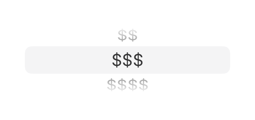
Picker (segmented)
iOS
Code
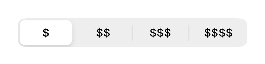
import { Host, Picker } from '@expo/ui/swift-ui'; <Host matchContents> <Picker options={['$', '$$', '$$$', '$$$$']} selectedIndex={selectedIndex} onOptionSelected={({ nativeEvent: { index } }) => { setSelectedIndex(index); }} variant="segmented" /> </Host>
_See also: official SwiftUI documentation _
Picker (wheel)
The wheel variant is not available on Apple TV.
iOS
Code
import { Host, Picker } from '@expo/ui/swift-ui'; <Host style={{ height: 100 }}> <Picker options={['$', '$$', '$$$', '$$$$']} selectedIndex={selectedIndex} onOptionSelected={({ nativeEvent: { index } }) => { setSelectedIndex(index); }} variant="wheel" /> </Host>
_See also: official SwiftUI documentation _
Slider
This component is not available on Apple TV.
iOS
Code
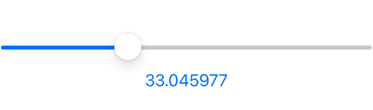
import { Host, Slider } from '@expo/ui/swift-ui'; <Host style={{ minHeight: 60 }}> <Slider value={value} onValueChange={(value) => { setValue(value); }} /> </Host>
_See also: official SwiftUI documentation _
Switch (toggle)
Note: Also known as Toggle.
iOS
Code
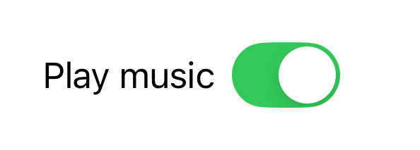
import { Host, Switch } from '@expo/ui/swift-ui'; <Host matchContents> <Switch checked={checked} onValueChange={checked => { setChecked(checked); }} color="#ff0000" label="Play music" variant="switch" /> </Host>
_See also: official SwiftUI documentation _
Switch (checkbox)
iOS
Code

import { Host, Switch } from '@expo/ui/swift-ui'; <Host matchContents> <Switch checked={checked} onValueChange={checked => { setChecked(checked); }} label="Play music" variant="checkbox" /> </Host>
_See also: official SwiftUI documentation _
TextField
iOS
Code
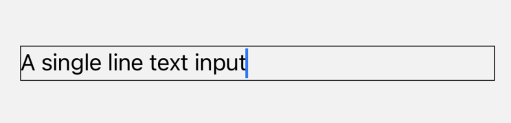
import { Host, TextField } from '@expo/ui/swift-ui'; <Host matchContents> <TextField autocorrection={false} defaultValue="A single line text input" onChangeText={setValue} /> </Host>
_See also: official SwiftUI documentation _
More
Expo UI is still in active development. We continue to add more functionality and may change the API. Some examples in the docs may not be up to date. If you want to see the latest changes, check the examples .
Full documentation is not yet available. Use TypeScript types to explore the API.
// Import from the SwiftUI package import { BottomSheet } from '@expo/ui/swift-ui';