📄 primeng/picklist
File: picklist.md | Updated: 11/15/2025
Source: https://primeng.org/picklist
-
Primary
Surface
PresetsAuraMaterialLaraNora
Ripple
RTL
-
v20
-
FEATURES
-
API
-
THEMING
-
PASSTHROUGH
PickList
PickList is used to reorder items between different lists.
Import #
import { PickListModule } from 'primeng/picklist';
Basic #
PickList is used as a controlled input with source and target properties. Content of a list item needs to be defined with the item template that receives an object in the list as parameter. Drag & drop functionality depends on @angular/cdk package.
- Bamboo Watch
- Black Watch
- Blue Band
- Blue T-Shirt
- Bracelet
- Brown Purse
- Chakra Bracelet
- Galaxy Earrings
- Game Controller
- Gaming Set
No selected item
No selected item
<p-picklist [source]="sourceProducts" [target]="targetProducts" [dragdrop]="true" [responsive]="true" breakpoint="1400px"> <ng-template let-item #item> {{ item.name }} </ng-template> </p-picklist>
Filter #
Filter value is checked against the property of an object configured with the filterBy property.
Search results are available
- Bamboo Watch
- Black Watch
- Blue Band
- Blue T-Shirt
- Bracelet
- Brown Purse
- Chakra Bracelet
- Galaxy Earrings
- Game Controller
- Gaming Set
No selected item
No results found
No selected item
<p-picklist [source]="sourceProducts" [target]="targetProducts" [dragdrop]="true" [responsive]="true" filterBy="name" sourceFilterPlaceholder="Search by name" targetFilterPlaceholder="Search by name" breakpoint="1400px" scrollHeight="20rem" > <ng-template let-option let-selected="selected" #option> <div class="flex flex-wrap p-1 items-center gap-4 w-full"> <img class="w-12 shrink-0 rounded" src="https://primefaces.org/cdn/primeng/images/demo/product/{{ option.image }}" [alt]="option.name" /> <div class="flex-1 flex flex-col"> <span class="font-medium text-sm">{{ option.name }}</span> <span [ngClass]="{ 'text-surface-500': !selected, 'dark:text-surface-400': !selected, 'text-inherit': selected, }" >{{ option.category }}</span > </div> <span class="font-bold sm:ml-8">{{ '$' + option.price }}</span> </div> </ng-template> </p-picklist>
Template #
For custom content support define an item template that gets the item instance as a parameter. In addition sourceheader and targetheader templates are provided for further customization.
-

Bamboo WatchAccessories
$65
-

Black WatchAccessories
$72
-
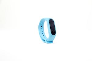
Blue BandFitness
$79
-
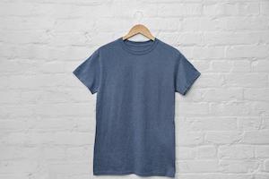
Blue T-ShirtClothing
$29
-
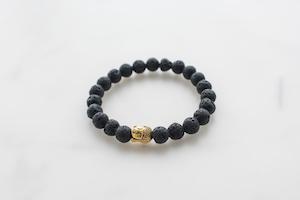
BraceletAccessories
$15
-
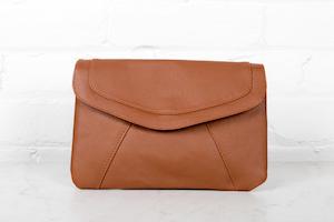
Brown PurseAccessories
$120
-
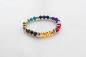
Chakra BraceletAccessories
$32
-
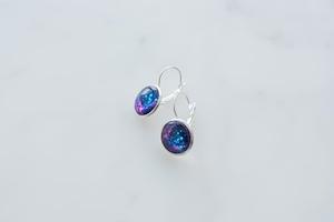
Galaxy EarringsAccessories
$34
-

Game ControllerElectronics
$99
-

Gaming SetElectronics
$299
No selected item
No selected item
<p-picklist [source]="sourceProducts" [target]="targetProducts" [dragdrop]="true" [responsive]="true" sourceFilterPlaceholder="Search by name" targetFilterPlaceholder="Search by name" breakpoint="1400px" scrollHeight="20rem"> <ng-template let-option let-selected="selected" #item> <div class="flex flex-wrap p-1 items-center gap-4 w-full"> <img class="w-12 shrink-0 rounded" src="https://primefaces.org/cdn/primeng/images/demo/product/{{ option.image }}" [alt]="option.name" /> <div class="flex-1 flex flex-col"> <span class="font-medium text-sm">{{ option.name }}</span> <span [ngClass]="{ 'text-surface-500': !selected, 'dark:text-surface-400': !selected, 'text-inherit': selected, }" >{{ option.category }}</span > </div> <span class="font-bold sm:ml-8">{{ '$' + option.price }}</span> </div> </ng-template> </p-picklist>
Accessibility #
Screen Reader
Value to describe the source listbox and target listbox can be provided with ariaLabelledBy or ariaLabel props. The list elements has a listbox role with the aria-multiselectable attribute. Each list item has an option role with aria-selected and aria-disabled as their attributes.
Controls buttons are button elements with an aria-label that refers to the aria.moveTop, aria.moveUp, aria.moveDown, aria.moveBottom,aria.moveTo, aria.moveAllTo, aria.moveFrom and aria.moveAllFrom properties of the locale API by default, alternatively you may use_moveTopButtonProps_, moveUpButtonProps, moveDownButtonProps, moveToButtonProps, moveAllToButtonProps, moveFromButtonProps, moveFromButtonProps and moveAllFromButtonProps to customize the buttons like overriding the default aria-label attributes.
<span id="lb">Options</span> <p-picklist ariaLabelledBy="lb" />
<p-picklist ariaLabel="City" />
PickList Keyboard Support
| Key | Function | | --- | --- | | tab | Moves focus to the first selected option, if there is none then first option receives the focus. | | up arrow | Moves focus to the previous option. | | down arrow | Moves focus to the next option. | | enter | Toggles the selected state of the focused option. | | space | Toggles the selected state of the focused option. | | home | Moves focus to the first option. | | end | Moves focus to the last option. | | shift + down arrow | Moves focus to the next option and toggles the selection state. | | shift + up arrow | Moves focus to the previous option and toggles the selection state. | | shift + space | Selects the items between the most recently selected option and the focused option. | | control + shift + home | Selects the focused options and all the options up to the first one. | | control + shift + end | Selects the focused options and all the options down to the first one. | | control + a | Selects all options. |
Buttons Keyboard Support
| Key | Function | | --- | --- | | enter | Executes button action. | | space | Executes button action. |
-
Import
-
Basic
-
Filter
-
Template
-
Accessibility
Figma UI Kit
The official Figma UI Kit for Prime UI libraries, the essential resource for designing with PrimeOne components.
PrimeNG 20.3.0 by PrimeTek