📄 radixui/themes/docs/components/card
File: card.md | Updated: 11/15/2025
Source: https://www.radix-ui.com/themes/docs/components/card
ThemesThemes PrimitivesPrimitives IconsIcons ColorsColors
Overview
Getting started Styling Layout Releases Resources
Theme
Overview Color Dark mode Typography Spacing Breakpoints Radius Shadows Cursors
Layout
Box Flex Grid Container Section
Typography
Text Heading Blockquote Code Em Kbd Link Quote Strong
Components
Alert Dialog Aspect Ratio Avatar Badge Button Callout Card Checkbox Checkbox Group Checkbox Cards Context Menu Data List Dialog Dropdown Menu Hover Card Icon Button Inset Popover Progress Radio Radio Group Radio Cards Scroll Area Segmented Control Select Separator Skeleton Slider Spinner Switch Table Tabs Tab Nav Text Area Text Field Tooltip
Utilities
Accessible Icon Portal Reset Slot Theme Visually Hidden
Components
Card
Container that groups related content and actions.
View source Report an issue View in Playground
Teodros Girmay
Engineering
<Box maxWidth="240px">
	<Card>
		<Flex gap="3" align="center">
			<Avatar
				size="3"
				src="https://images.unsplash.com/photo-1607346256330-dee7af15f7c5?&w=64&h=64&dpr=2&q=70&crop=focalpoint&fp-x=0.67&fp-y=0.5&fp-z=1.4&fit=crop"
				radius="full"
				fallback="T"
			/>
			<Box>
				<Text as="div" size="2" weight="bold">
					Teodros Girmay
				</Text>
				<Text as="div" size="2" color="gray">
					Engineering
				</Text>
			</Box>
		</Flex>
	</Card>
</Box>
This component is based on the div element and supports common margin props
.
| Prop | Type | Default |
| --- | --- | --- |
| asChild<br><br>Prop description | boolean | No default value |
| size | Responsive<"1" \| "2" \| "3" \| "4" \| "5"> | "1" |
| variant<br><br>Prop description | "surface" \| "classic" \| "ghost" | "surface" |
As another element
Use the asChild prop to render the card as a link or a button. This prop adds styles for the interactive states, like hover and focus.
Quick start
Start building your next project in minutes
<Box maxWidth="350px">
	<Card asChild>
		<a href="#">
			<Text as="div" size="2" weight="bold">
				Quick start
			</Text>
			<Text as="div" color="gray" size="2">
				Start building your next project in minutes
			</Text>
		</a>
	</Card>
</Box>
Size
Use the size prop to control the size.
T
Teodros Girmay
Engineering
T
Teodros Girmay
Engineering
T
Teodros Girmay
Engineering
<Flex gap="3" direction="column">
	<Box width="350px">
		<Card size="1">
			<Flex gap="3" align="center">
				<Avatar size="3" radius="full" fallback="T" color="indigo" />
				<Box>
					<Text as="div" size="2" weight="bold">
						Teodros Girmay
					</Text>
					<Text as="div" size="2" color="gray">
						Engineering
					</Text>
				</Box>
			</Flex>
		</Card>
	</Box>

	<Box width="400px">
		<Card size="2">
			<Flex gap="4" align="center">
				<Avatar size="4" radius="full" fallback="T" color="indigo" />
				<Box>
					<Text as="div" weight="bold">
						Teodros Girmay
					</Text>
					<Text as="div" color="gray">
						Engineering
					</Text>
				</Box>
			</Flex>
		</Card>
	</Box>

	<Box width="500px">
		<Card size="3">
			<Flex gap="4" align="center">
				<Avatar size="5" radius="full" fallback="T" color="indigo" />
				<Box>
					<Text as="div" size="4" weight="bold">
						Teodros Girmay
					</Text>
					<Text as="div" size="4" color="gray">
						Engineering
					</Text>
				</Box>
			</Flex>
		</Card>
	</Box>
</Flex>
Variant
Use the variant prop to control the visual style.
Quick start
Start building your next project in minutes
Quick start
Start building your next project in minutes
<Flex direction="column" gap="3" maxWidth="350px">
	<Card variant="surface">
		<Text as="div" size="2" weight="bold">
			Quick start
		</Text>
		<Text as="div" color="gray" size="2">
			Start building your next project in minutes
		</Text>
	</Card>

	<Card variant="classic">
		<Text as="div" size="2" weight="bold">
			Quick start
		</Text>
		<Text as="div" color="gray" size="2">
			Start building your next project in minutes
		</Text>
	</Card>
</Flex>
With inset content
Use the Inset component to align content flush with the sides of the card.
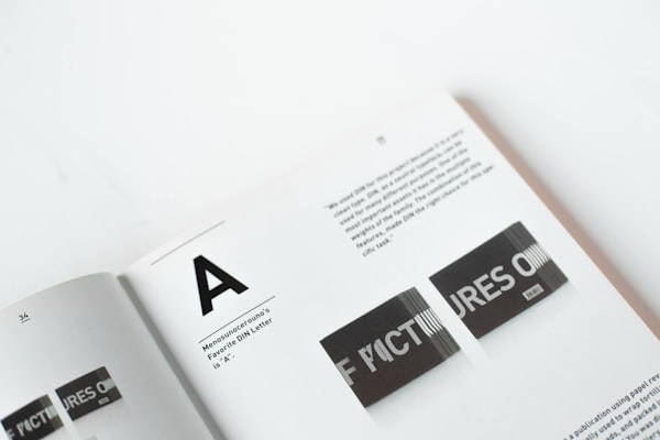
Typography is the art and technique of arranging type to make written language legible, readable and appealing when displayed.
<Box maxWidth="240px">
	<Card size="2">
		<Inset clip="padding-box" side="top" pb="current">
			<img
				src="https://images.unsplash.com/photo-1617050318658-a9a3175e34cb?ixlib=rb-4.0.3&ixid=M3wxMjA3fDB8MHxwaG90by1wYWdlfHx8fGVufDB8fHx8fA%3D%3D&auto=format&fit=crop&w=600&q=80"
				alt="Bold typography"
				style={{
					display: "block",
					objectFit: "cover",
					width: "100%",
					height: 140,
					backgroundColor: "var(--gray-5)",
				}}
			/>
		</Inset>
		<Text as="p" size="3">
			<Strong>Typography</Strong> is the art and technique of arranging type to
			make written language legible, readable and appealing when displayed.
		</Text>
	</Card>
</Box>
PreviousCallout
NextCheckbox

